The examples below focuses on light and shadow while simultaneously depicting surface qualities of texture, reflection and transparency. For any assignments regarding black and white rendering (shading) the strategic use of soft and hard edges, full range of grayscales, full range of mark making, articulation of detail (and progressive lack of detail) and different levels of high and low contrast will be required.
For these assignments it is also required to have a composition of subject matter that is unique and interesting but also integrates all the required assignment objectives in the work. As well allow for time to choose the appropriate objects. Pick objects that will allow for a clear and large areas of shadows to be present. If the shadows progress from light to dark that will be even better. Picking an object that presents interesting shadows and highlights is imperative to meet the objectives. If your object can also be thematic and not cliche while still addressing the objectives that will be a bonus.
Strategically using a full range of graphite from 2H to 6B, and having a kneaded eraser and light source such as a clip on lamp will be very useful for the success of the project.
 Interior Design Student Work
The above graphite drawing demonstrates a refined rendering style that offers a strategic use of detail and high contrast in the foreground. As well the drawing progressively decreases in detail and contrast as the viewer reaches the background. As well due primarily to the increased contrast, the edges in the foreground appear sharper, while the edges of forms in the background begin to slightly dissolve. A very good drawing but more absorbing of line, greater range of soft to sharp edges and a clearer depiction of the three surfaces of texture, reflection and transparency is required.
 Interior Design Student Work
The above graphite drawing demonstrates a strategic use of detail and high contrast in the foreground. As well the drawing progressively decreases in detail and contrast as the viewer reaches the background. As well the edges in the foreground are sharper and the edges of forms in the background are progressively dissolving into the background space. A very good drawing but clearer depiction of reflective and transparent surfaces are required.
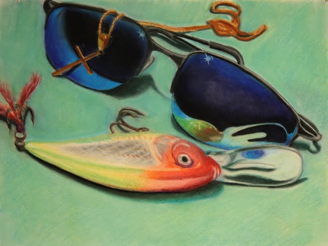
Other Examples of Student Work
Below are some student examples of work from 1st year drawing courses at the school of art. The examples below offers ideas in terms of objects that may be used and include graphite as the medium to complete the drawing. Other examples below include the use of charcoal and chalk as well as black and white cote. There is also an example where a student has used a black paper and white chalk and conte as the main drawing tools. Some examples do not present objects that are transparent, reflective or textured but offer examples for other ideas that are required when depicting objects in other assignments. The above example presents a work that depicts a transparent, reflective objects. For the most part texture is represented on the base that the objects are placed on.
 The above example presents a work that depicts a transparent, reflective objects. For the most part texture is represented on the base that the objects are placed on.
 The above example presents a work that depicts a transparent, reflective and textured object.
 The above example presents an exceptional work that depicts a transparent, reflective and textured object. The composition is very interesting and overall utilizes a combination of mixing white and black to achieve a grayscale as well as utilizing the white of the paper.
 Detail of textured and transparent objects in previous drawing.
 Detail of a reflective object in previous drawing.
 The drawing above uses white drawing mediums on black paper to depict an excellent level of transparency and texture in objects.
 The above example presents a very good depiction of reflective and transparent objects. As well the objects are given a context that suggest thematic content with the anticipation of the knife cutting into the vegetable. This work at a basic level begins to convey possible symbolic or metaphorical content.
Grayscale:
 The above is an example of a 16 step digital grayscale. All rendered black and white drawings are required to utilize the grayscale for each black and white material used in the course.
The grayscale in a drawing is achieved by layering a black medium and allowing different levels of the white of the paper to come through in a drawing, OR a grayscale is achieved by mixing black and white mediums to achieve the range presented in the above grayscale. Often drawings use a combination of both methods (utilizing the white of the paper AND mixing the white with black drawing mediums together)
Creating your own grayscale for each drawing medium will assist in learning about each drawing materials characteristics, plus will allow you to practice depicting and to be more sensitized to the full range of grays in a drawing. Once each grayscale is completed it can be used to compare grayscale levels in a drawing ultimately assisting in the overall success of any given drawing.
Value, Tints and Shades:

 The drawings above demonstrates a depiction of value. Colour has been translated into grayscale. During most of the rendering assignments the objective will be to ignore translating colour and instead will focus on light and shadow and at times will depict surface qualities of texture, reflection and transparency.
Reflective Surface:
 The above drawing demonstrates an exceptional depiction of an object with a reflective surface that has very difficult proportions to draw. For the most part there is very good strategic use of detail, edges (soft to sharp) and a good range of contrast and grayscale. Perhaps cropping the object has created some slight spatial confusion (often when a form is cropped at the picture's border it will optically move towards the viewer) but over all this work is an excellent example of a reflective object.
Ideas and Process:
Strategic use of contrast and levels of detail
 The above drawing of garlic clover is unfinished and is not an example of reflective or transparent surface, but demonstrates some of the key objectives for drawing objects with light and shadow. The drawing demonstrates a strategic use of detail and high contrast in the foreground. As well the drawing progressively decreases in detail and contrast as the viewer reaches the background (the clover that is farthest form in the picture) As well the edges in the foreground are sharper and the edges of the clovers in the background are progressively dissolving into the background space.
The process of the above garlic drawing is also excellent. This process entailed drawing lightly and tentatively over the entire paper and then in the mid to later stages detail and daker tones were layered onto the drawing.
Strategic use of contrast and levels of detail (work in progress)

Strategic use of contrast, levels of detail and variations of soft and sharp edges The above drawing of a white porcelain object is also a good example of a white or an off-white object. With the exception of a vaguely drawn table plane in the foreground area the execution of the drawing fulfills the objectives of the assignment. The entire page is filled with various tones and a strong sense of mass (the objects forms) are depicted an atmosphere. Some parts of the above object appear to almost pop out from the page of the paper. This drawing as well demonstrates a strategic use of detail and high contrast in the foreground. As well the drawing progressively decreases in detail and in contrast as the viewer reaches the background and furthest edges of the object. As well the edges in the foreground (center of the object) are sharper and the outer edges of the object progressively dissolving into the background space. Overall this work is an excellent example of strategically depicting soft and sharp edges in relation to space.
 The above drawing of a white porcelain object is also a good example of a white or an off-white object. With the exception of a vaguely drawn table plane in the foreground area the execution of the drawing fulfills the objectives of the assignment. The entire page is filled with various tones and a strong sense of mass (the objects forms) are depicted an atmosphere. Some parts of the above object appear to almost pop out from the page of the paper. This drawing as well demonstrates a strategic use of detail and high contrast in the foreground. As well the drawing progressively decreases in detail and in contrast as the viewer reaches the background and furthest edges of the object. As well the edges in the foreground (center of the object) are sharper and the outer edges of the object progressively dissolving into the background space. Overall this work is an excellent example of strategically depicting soft and sharp edges in relation to space.